TL;DR
This post is about my other passion, comic books. I found one UX issue while enjoying Inkal comic book.
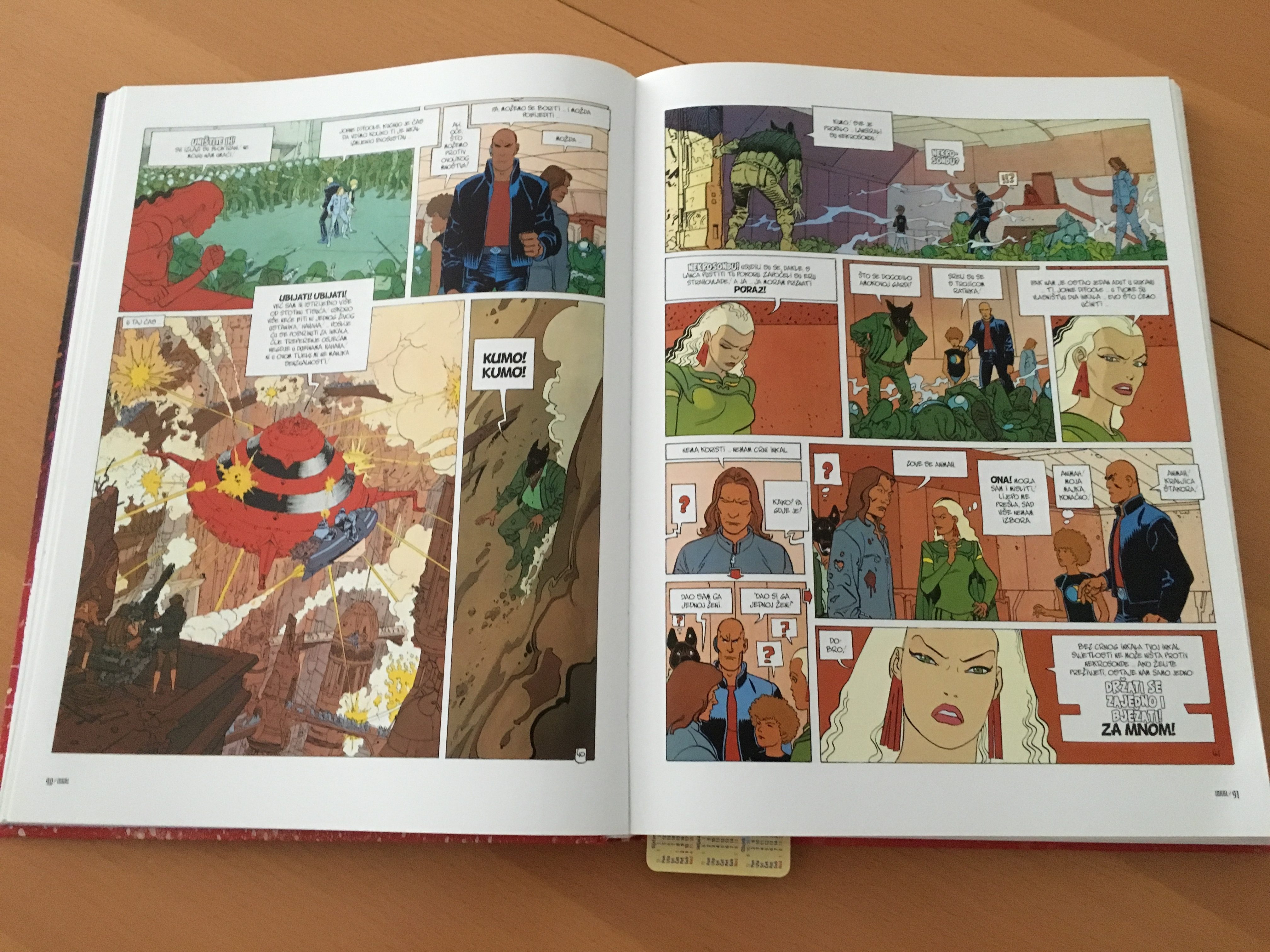
Observe following photo:

On the right side, my user experience was broken. Can you identify the issue?
Everybody who reads from left to right, reads comic books in the same fashion. Actually, expects that comic book panels (frames or boxes) follows that flow. On the right side, that flow was broken. Note the arrows put by the editor. Those arrows are there to define panel flow that is different from the other parts of the comic book.
Why? My test idea is that editor needed to satisfy requirement that there must not be empty space on a page.
In first past, I automatically followed left-right panel direction, so I lost the flow. I needed to stop in order to comprehend story flow.
Which is better, empty panel or uninterrupted reader flow?


Yes. I too read from Left to Right #UX