TL;DR
This week we found the UX LinkedIn issue. It is related to minimize missing window feature.
Javascript was “invented” to bring to the Browser applications desktop features. One of the essential desktop features is the window management system (history teaches us that this how Windows OS got its name).
In computing, a window is a graphical control element. It consists of a visual area containing some of the graphical user interfaces of the program it belongs to and is framed by a window decoration [wikipedia].
In user interface design for computer applications, a modal window is a graphical control element subordinate to an application’s main window. It creates a mode that disables the main window but keeps it visible, with the modal window as a child window in front of it [wikipedia].
Here are use cases for the modal window:
-
Drawing attention to vital pieces of information
-
Blocking the application flow until the information required to continue is entered, as for example, a password in a login process.
-
Collecting application configuration options in a centralized dialog
-
Warning that the effects of the current action are not reversible
The Bug
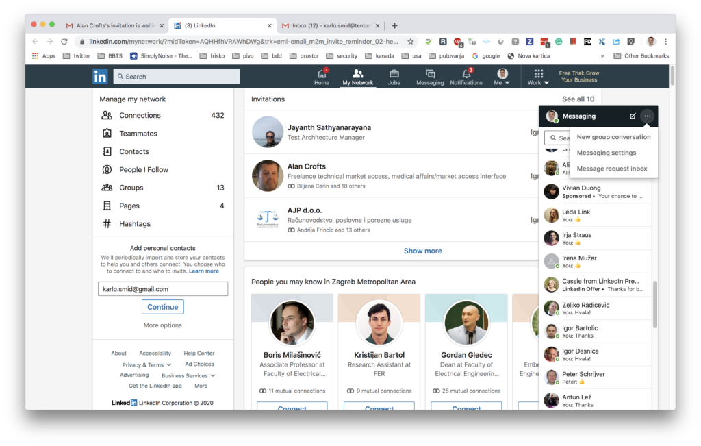
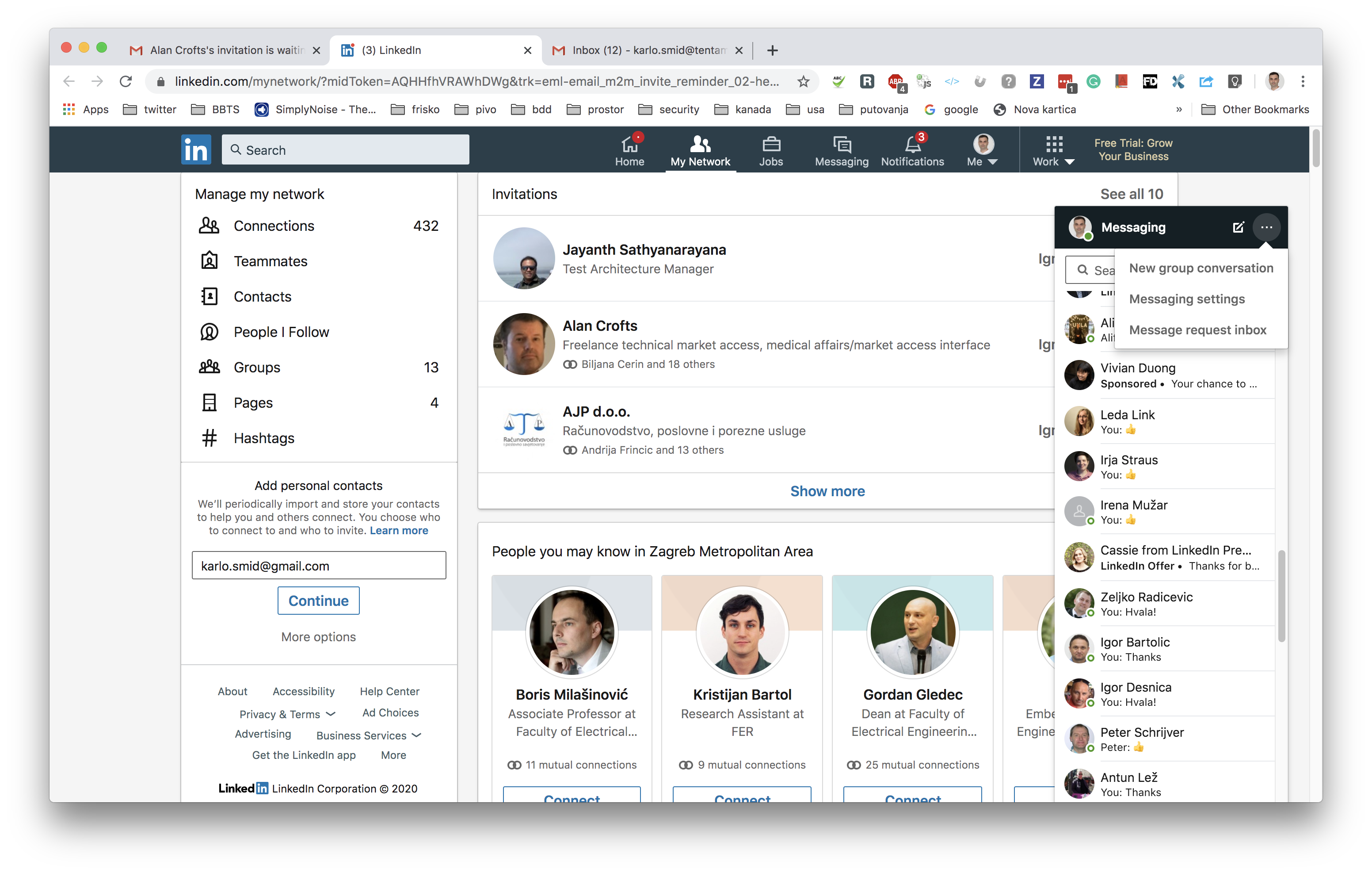
In the image above, you can see my LinkedIn page after I login in. There is a messaging modal window, with the missing features, minimize, or close. It is evident that this messaging window hides essential information, and that is the button for accepting/rejecting an invitation.
Reson for this bug is that LinkedIn obviously did not test the message window feature for my resolution. They test it on higher resolutions where the messaging window has more room on the right, so it does not hide invitation buttons.
LinkedIn did not test the window messaging feature in cooperation with the invitation feature.
Remember
You could easily catch that issue by doing scenario testing, where you would combine messaging window and invitation features. Or with configuration testing where you would vary typical screen resolutions.


