TL;DR
We continue our testing from the trenches series by finding random issues. This time, we present you with a macOS UX inconsistency.
The Problem
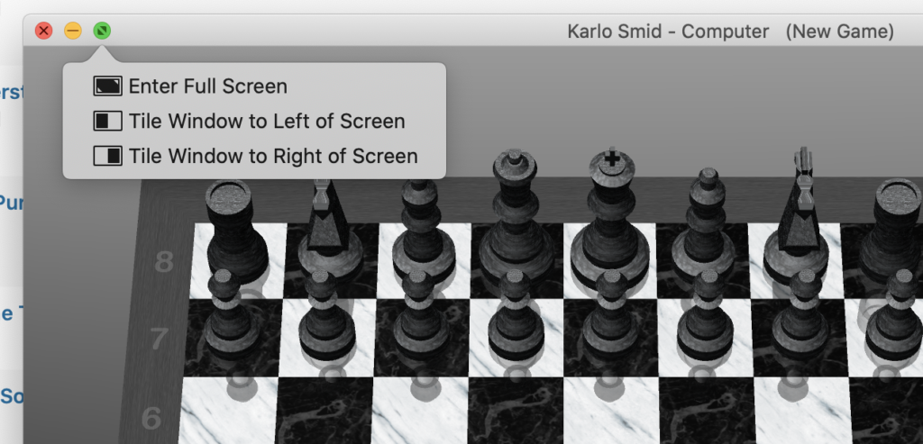
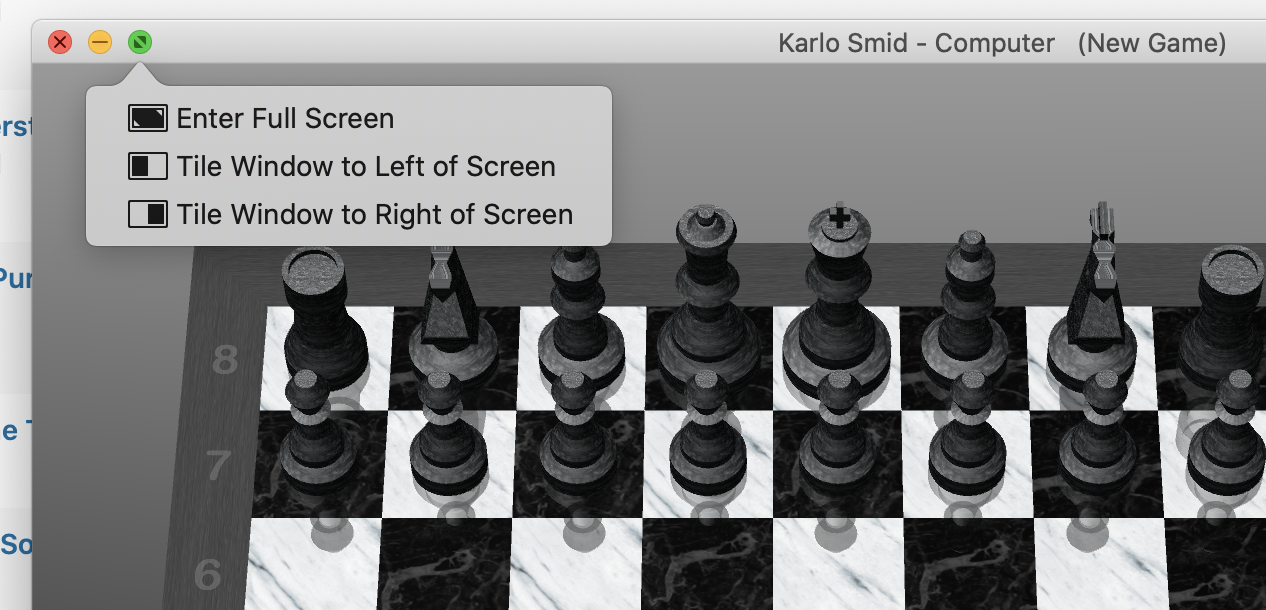
The problem is clearly depicted in the above image. When you open the macOS Catalina Chess application, it will open in not a full-sized window. Hover with the mouse pointer over the green button in the upper left window corner, and a tooltip will appear. UX problem is in inconsistency between colored buttons and icons in the tooltip. Those are not the same. Also, the tooltip only appears when hovering above the green button.
Why Is This Problem A Bug
Because it is not consistent with Apple’s image. And here is Ashton Kutcher explanation:


